Customize your Flow integration
Last updated: August 12, 2026
Once you've integrated Flow, you can customize the colors, fonts, and borders of the various UI elements to match your website design.
To customize the properties:
- Create an
appearanceobject and include the color, font, or border keys you want to customize, along with their values. For example:
- Create a
componentOptionsobject and include the customization options for the individual components you want to modify:
- Pass the
appearanceandcomponentOptionsobjects when you create the instance ofCheckoutWebComponents.
You can customize the color of the following UI elements:
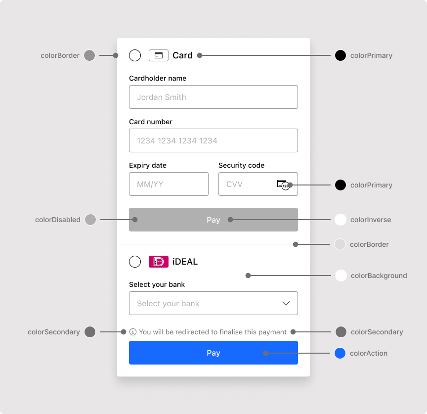
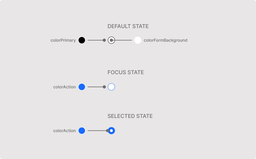
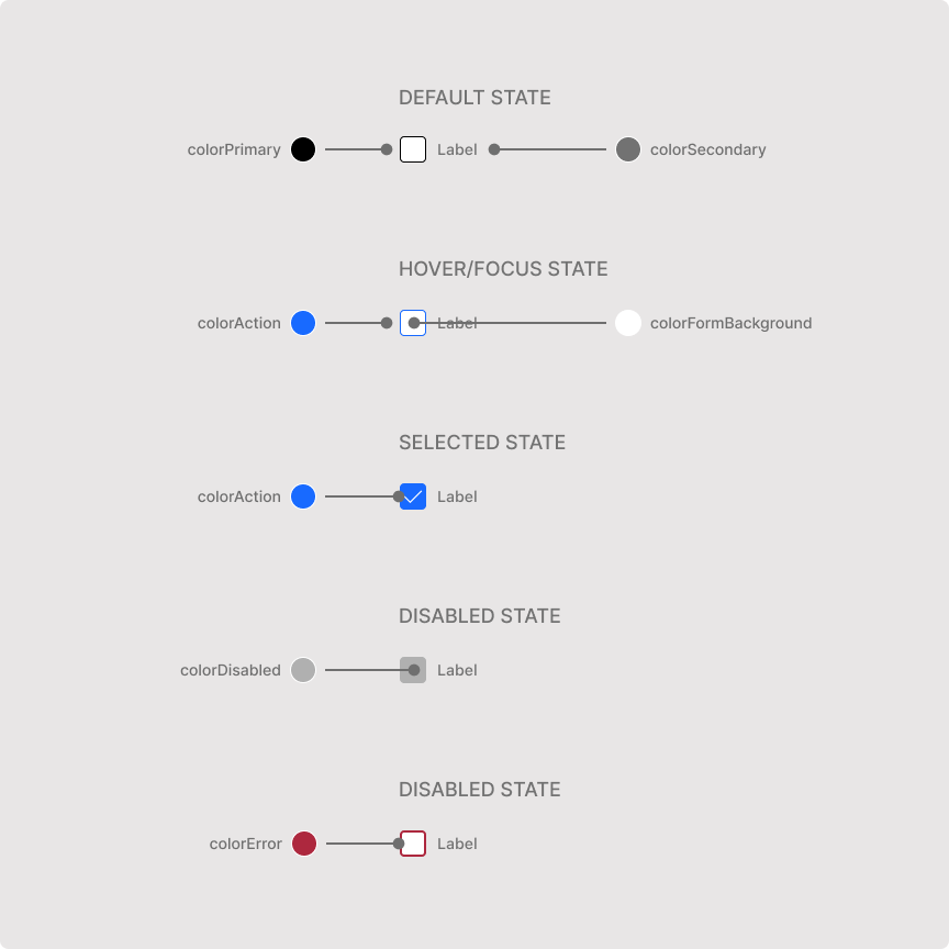
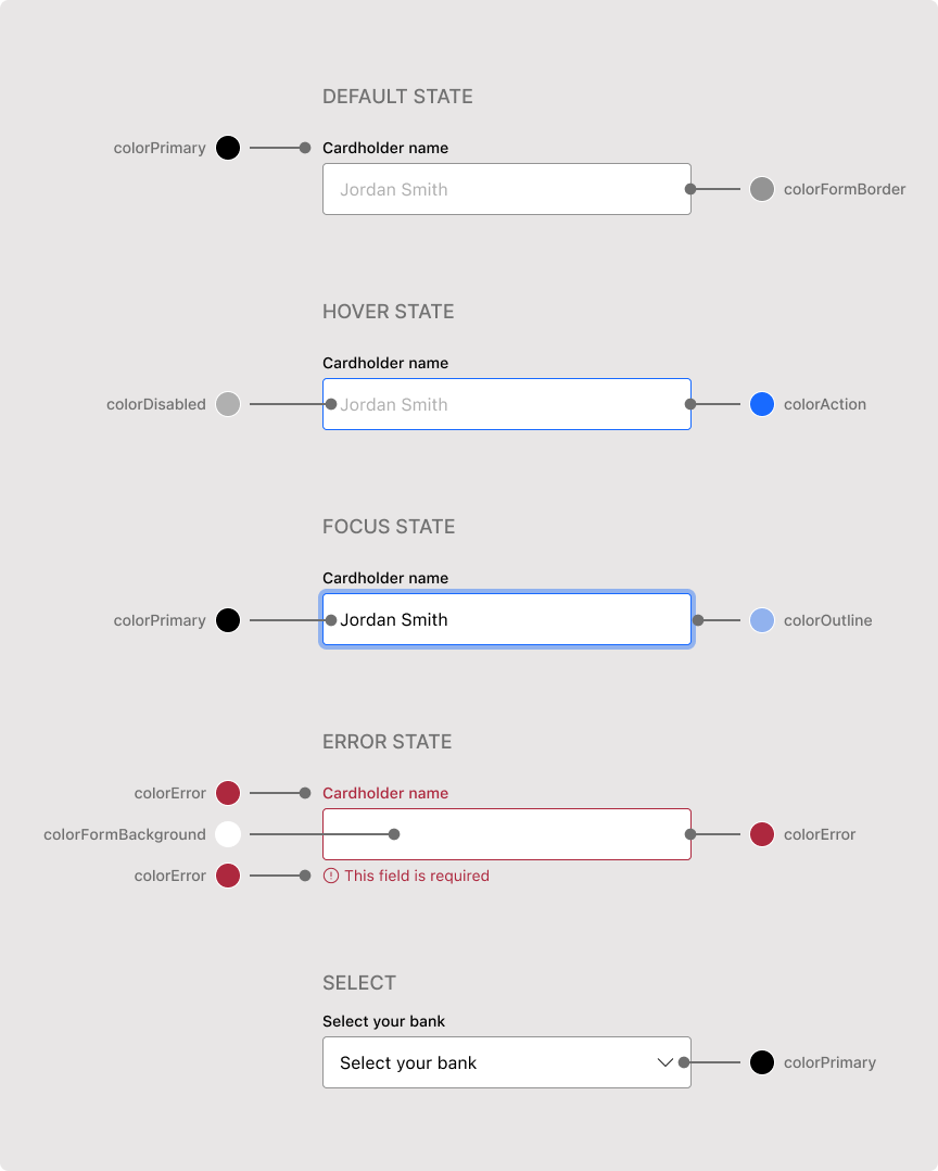
To customize an element, provide a CSS color value to any of the following keys:
| Key | Format |
|---|---|
|
|
|
|
|
|
|
|
|
|
|
|
|
|
|
|
|
|
|
|
|
|
|
|
To make Flow use the same fonts as your website, use web fonts and set the font family names in the fontFamily key.
Information
Custom web fonts are not supported in card detail input fields. To ensure consistency across all UI elements, provide web safe fonts and default fonts as a fallback.
Use the following properties to modify the fonts for specific UI elements:
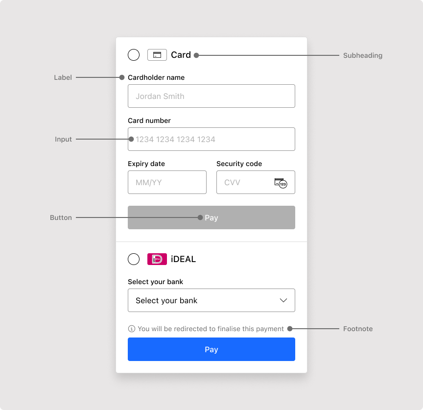
| Property | Type |
|---|---|
|
|
|
|
|
|
|
|
|
|
You can modify the following sub-properties of each font property:
| Property | Type | Example |
|---|---|---|
|
|
|
|
|
|
|
|
|
|
|
|
|
|
|
Information
To modify the text displayed in the UI, add a custom translation. For example, to change the text displayed within the payment button.
Use the following properties to modify the borders for specific UI elements:
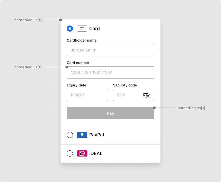
| Property | Type | Example |
|---|---|---|
| An |
|
You can control the border width and color of each side of an input independently. The following optional tokens override the uniform borderWidth and colorFormBorder values for the specified side:
| Token | Type | Example |
|---|---|---|
| CSS length |
|
| CSS length |
|
| CSS length |
|
| CSS length |
|
| CSS color |
|
| CSS color |
|
| CSS color |
|
| CSS color |
|
These tokens apply to text inputs (such as billing address fields and cardholder name), secure card fields (card number, expiry date, and CVV), and selects (such as the country picker). They do not apply to checkboxes, radio buttons, the one-time-passcode field, or the open dropdown list.
Any token you leave unset inherits the uniform default, so existing integrations render exactly as before.
To remove a border side, set its width token to '0px'. Matching the border color to the page background is not equivalent: the border still occupies layout space, breaks on non-solid backgrounds, and reappears on focus and error states.
On error and disabled states, Flow recolors every visible side accordingly; zero-width sides stay hidden.
The following example produces an underline-style form with a bottom border only: